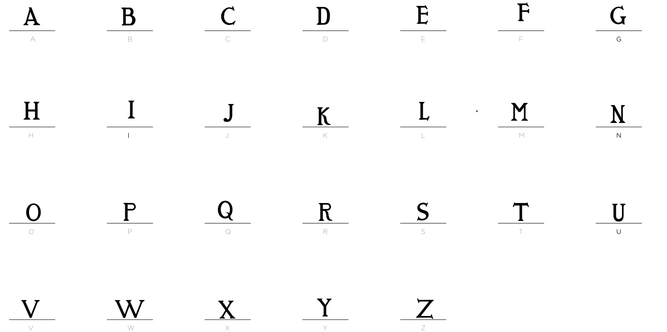
Type Design & Editorial Typography Project
I designed and developed this custom serif typeface from the ground up, starting with the structural construction of each letterform.
The project began with the study of proportions, vertical rhythm, and stroke contrast. I defined the modulation of thick and thin strokes, the serif structure, and the internal balance of counters to ensure harmony and consistency across the alphabet. Every glyph was drawn manually, focusing on precision, spacing, and optical correction.
Beyond individual letters, I built a coherent typographic system. Kerning, weight distribution, and rhythm were carefully calibrated to guarantee readability and visual balance in editorial contexts. Each character is designed to function both independently and as part of a unified text texture.
My approach combines classical serif references with contemporary refinement. The forms are essential and controlled, avoiding unnecessary ornamentation while maintaining personality and authority.
The final outcome is a functional and versatile editorial typeface. The project includes a complete lowercase set and a typographic specimen that demonstrates hierarchy, composition, and real layout application.